Sharp and dull booklet
Software used: Adobe InDesign
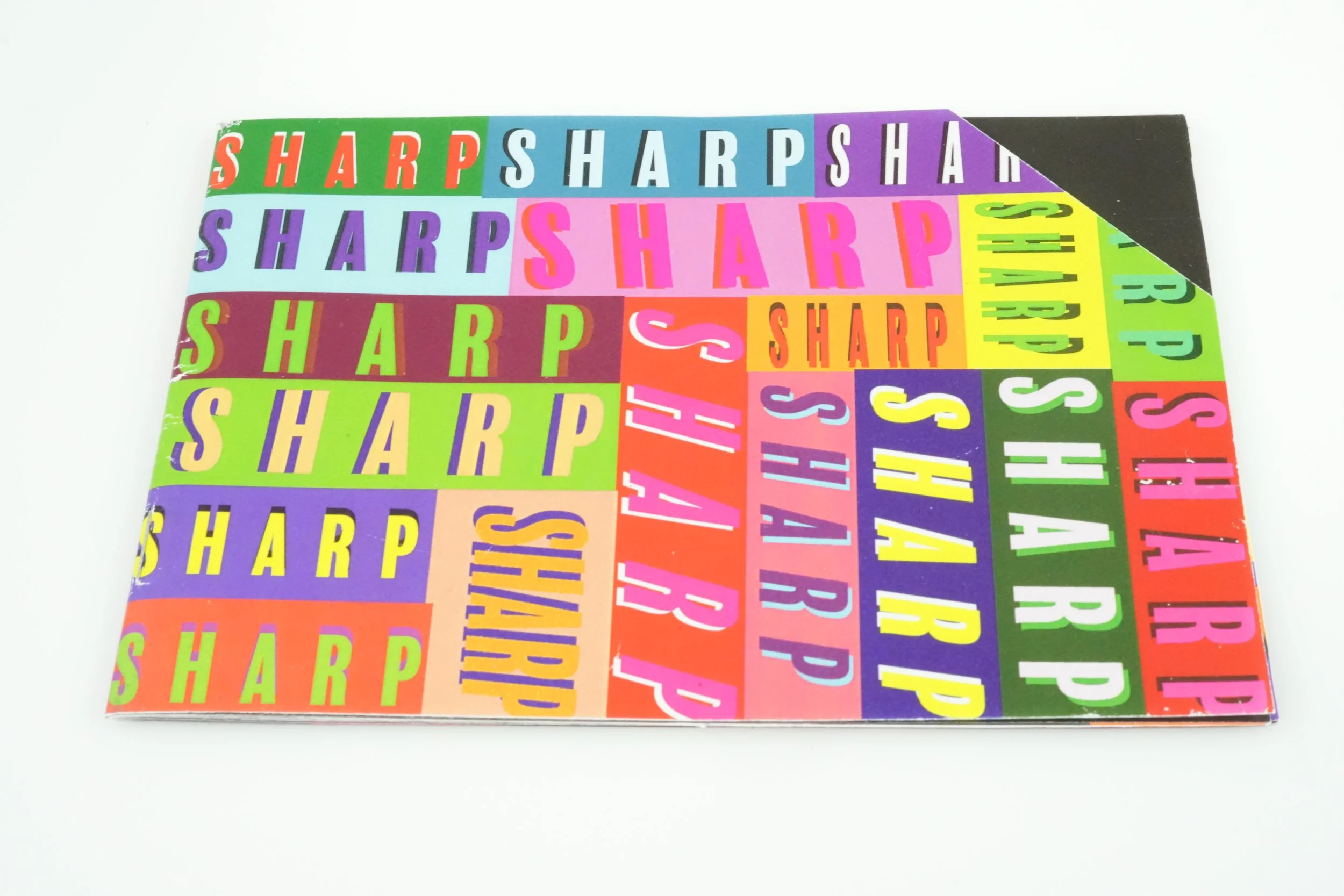
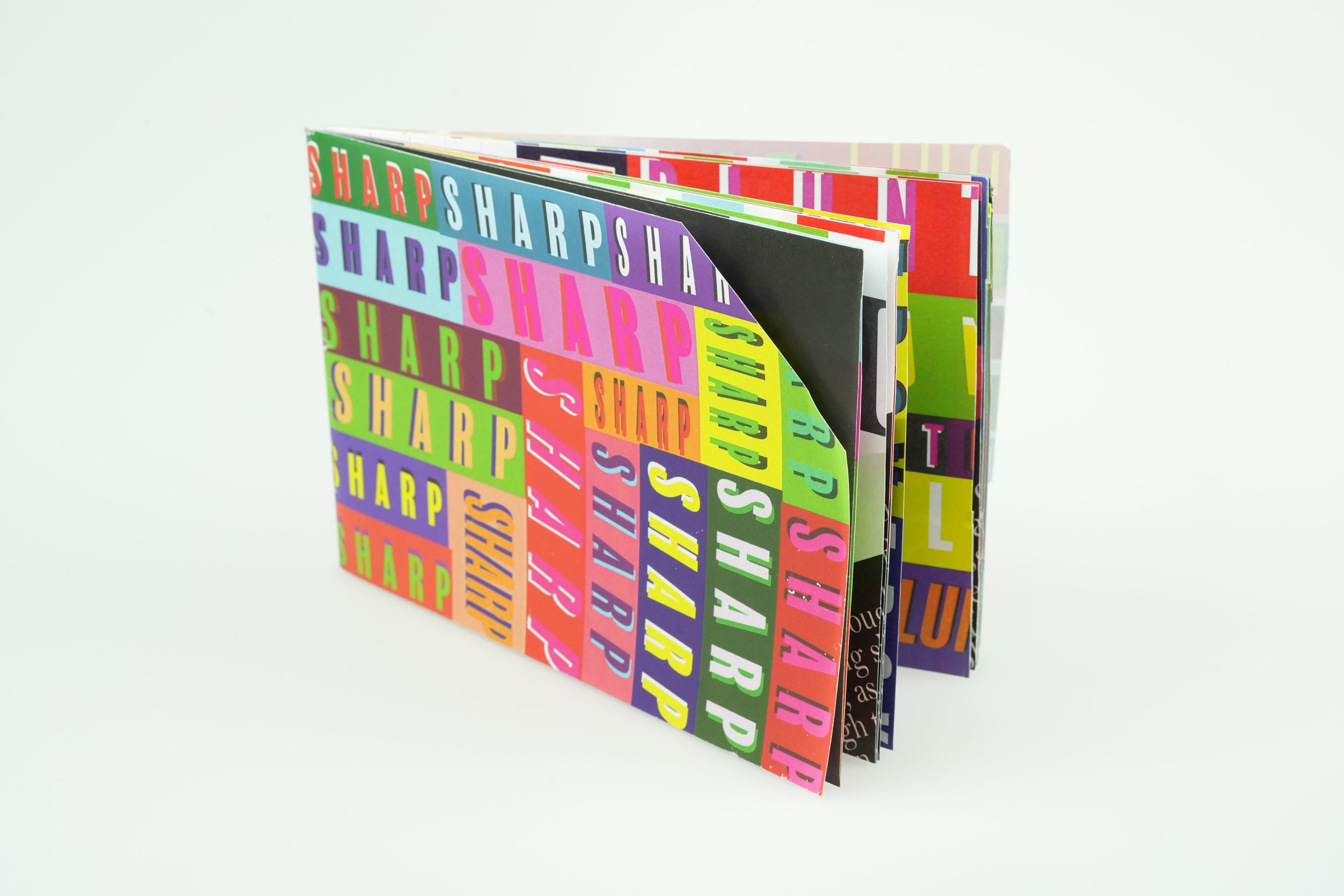
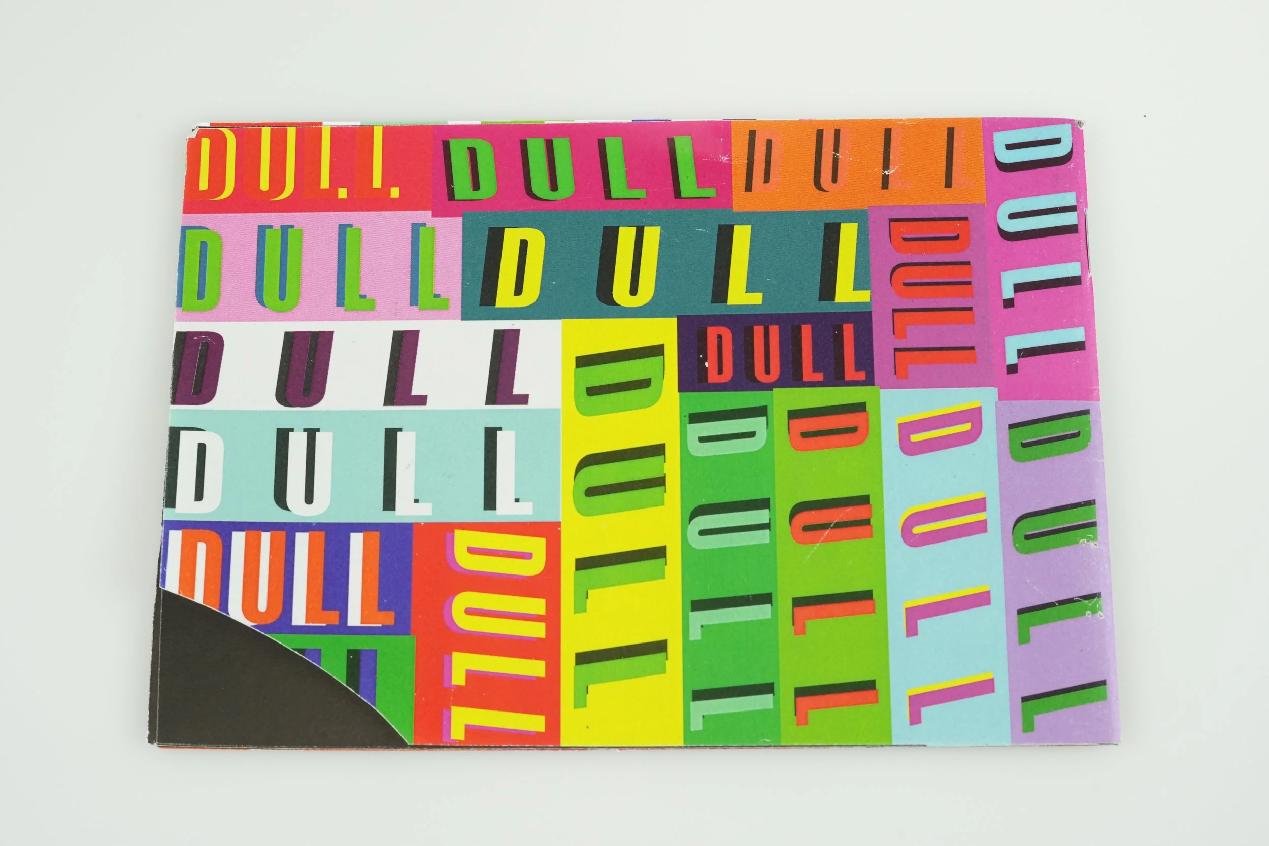
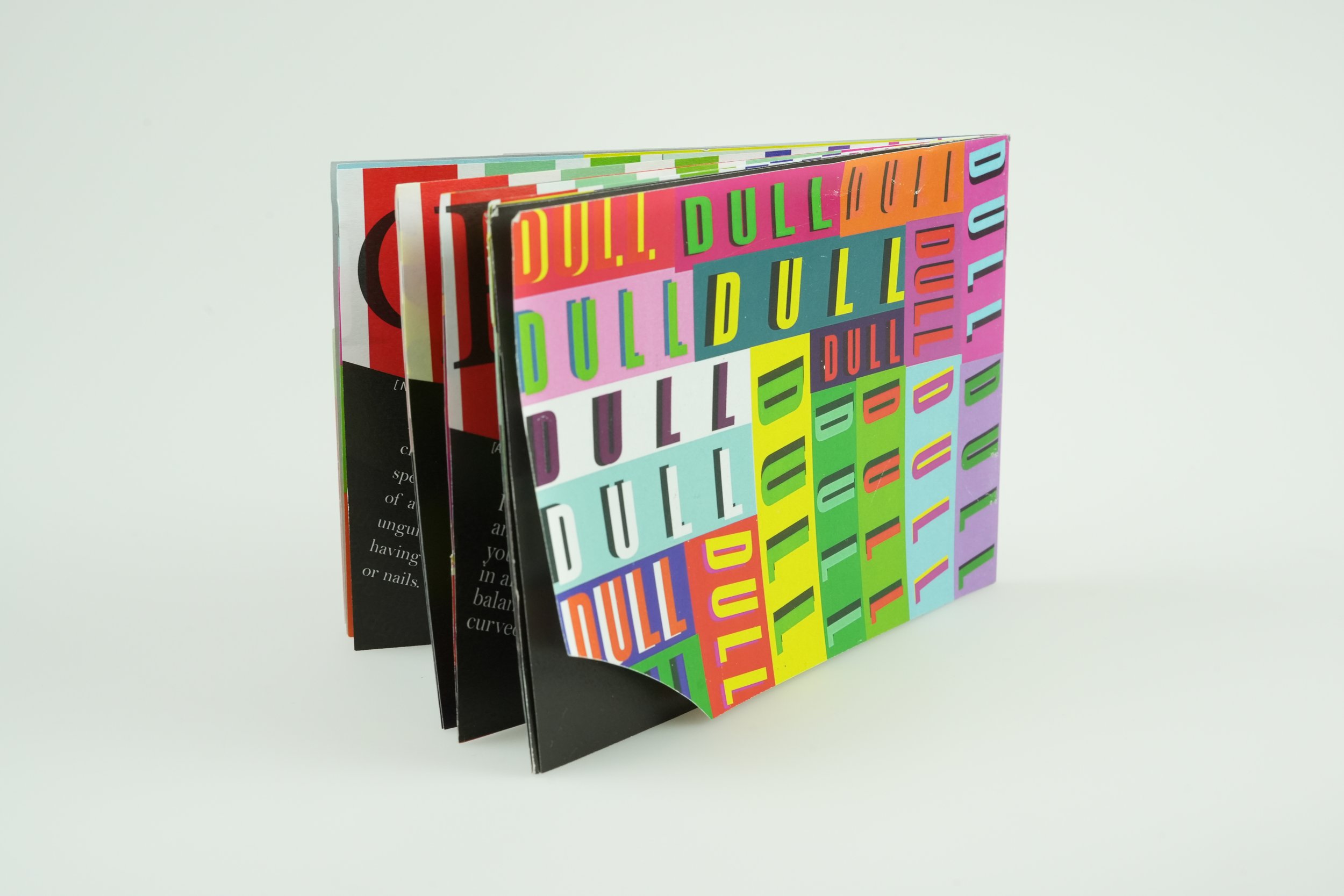
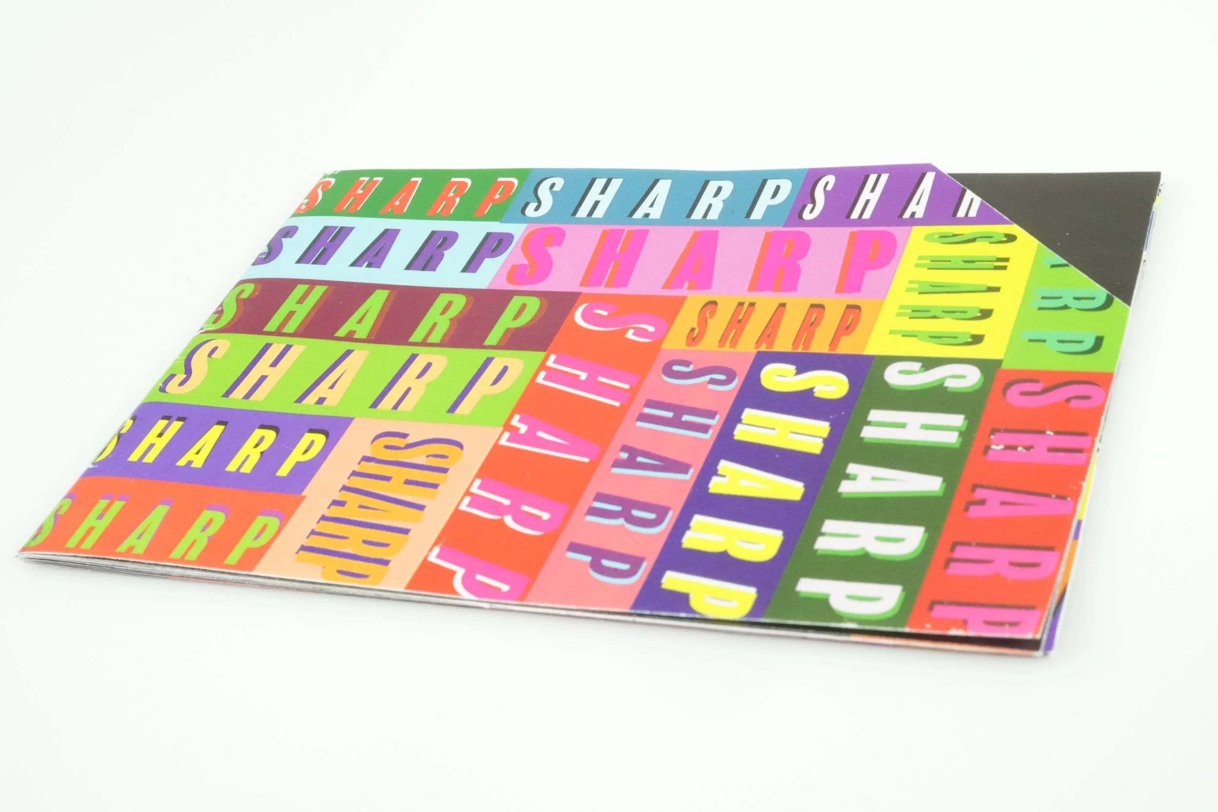
This booklet was created in Spring 2023 for a typography assignment focused on exploring adjectives through design. Each student chose a pair of contrasting words. Mine were “sharp” and “dull” and built out a collection of related adjectives and had to visually express their meanings. It was my first time designing and printing a full booklet, which made the project both exciting and a bit challenging.
I leaned into bright colors, crisp lines, and strong contrast to represent the other adjectives. The goal was to let the typography and color choices do the storytelling, showing how design can shift the mood and tone of a word without needing illustrations. I wanted the book to have a continuation, and could have a bit of an animation to it while flipping through. The main contrast design of the booklet moves throughout the book, creating a guiding bookmark.
This project helped me get a stronger grip on how type and color work together, especially in a printed format. I learned a lot about layout, pacing, and how to keep a design consistent across multiple pages. Looking back, I’m proud of how much I accomplished and how well the final booklet was produced.